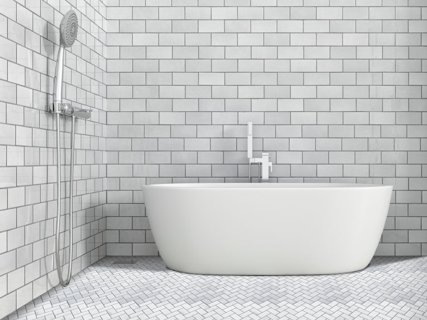
Creating a look that is aesthetically desirable out of a space that is limited in dimensions can be quite a task; more so when that space is as intensely intimate, but functionally restricted, as your bathroom.
Tile Ideas to Make Small Bathrooms Look Bigger
Should the tiles be large to enhance the roomy feeling? What if I like the look of small sized tiles? Will bold designs and bright colours make it look smaller, not larger? Should personal preferences in terms of design and colour then be sacrificed to pander to the space enhancing potential of the floor and wall tiles you choose?
Experts will have plenty to say in answer to each of these questions, bringing you no closer to a decision. So here are a few suggestions to help you make an informed decision.
Colour-smart Options
Trust the experts: lighter the colours, larger will be the perceived size of an enclosed space. White is, of course, the best to create an illusion of both light and roominess. Equally effective are neutral shades such as creams or pale grays.
Interesting patterns in mixed hues, pastel, bright and metallic, and combining glass/metal and stone mosaics, can do wonders for the décor, while relieving it of monochromatic monotony.
Design Effects
Artistic mosaic tiles with a dense pattern – floral, arabesque, geometric, graphics – in bold colours for two non-opposing, preferably, narrower portions of the walls.

- Image Source by Decor Papa
Another way can be as one of the walls in the shower, or as a backsplash to the vanity sink and counter and the rest in a complementary shade, design-neutral, would create a stunning contrast, apart from augmenting the sense of spaciousness. Alternatively, you could extend it from backsplash level right up to the wall.
A mix of bright porcelain part way up the wall from the floor and the rest in the medium will give you the same effect–large artistic mosaics with delicate motifs.
Floors with a difference
A different layout on the floor can make all the difference. Instead of the regular horizontal or vertical laying of tiles, if you go for the diagonal design, it will enhance the apparent width and length of the floor.
An option to this is using hexagonal tiles with grout lines filled in with the same colour. Do make sure that it is a non-glossy surface, lending a helpful, but unobtrusive base to the wall tile patterns.
Interplay of Grout lines
Less is usually more, in terms of maintenance, at least, where grout lines are concerned. These lines where the tiles join together can be a nightmare to clean. Yet, with brick-patterned mosaic, or that with a chevron or interlocking design, the grout lines can themselves form their own grid-like facade on the wall.
Large tiles, contrary to common belief, actually tend to make space look bigger. Pick those with a flush fit and fill in the grout lines in matching colour so that the flow of the texture or design remains continuous.
Right finish
Matte finish is non-reflective and slip-resistant, hence ideal for floors. Textured finishes are also slip-resistant and have a good grip. Both matte and textured finishes can be used for a traditional or rustic look.
Lappato finishes give an uneven, non-reflective surface and can be used in alcoves and niches, or as a backdrop for light fittings on walls to create a fascinating play of colour and texture that flows with your colour scheme.
Glossy, glazed, honed and polished finishes are great for backsplashes and even for the walls. They are easy to clean, with an urbane vibe to their appearance. Most importantly, they reflect light and make space appear to be bigger.
A space that’s uniquely ‘you’
All said and done, it’s your private space, so bend the design rules and craft that look which makes it seem bigger than it is and as beautiful as you want it to be. And if you need tiling, styling assistance, do visit Decorpapa.com where you will find their exciting range of tile designs, accessories, as well as a design consultant to guide you on your décor project!


